The Perfect Backdrop: Selecting Wall Colours and Finishes that Make Your Custom Textiles Pop

Understanding Colour Theory Basics

You’ve spent time and money selecting the perfect custom textiles for your home—gorgeous curtains, a one-of-a-kind rug, or plush throw pillows. Now, the next step is to choose a wall colour that makes them shine instead of shrink. The right paint job is more than just a background; it’s a supporting character that highlights your design choices, and expert edmonton painting services can bring that vision to life.

Before you start grabbing paint swatches, a little colour theory goes a long way. The colour wheel is your best friend here. Complementary colours (opposites on the wheel, like blue and orange) create a vibrant, high-contrast look. Analogous colours (next to each other on the wheel, like blue, blue-green, and green) offer a more serene and cohesive feel. This foundational knowledge helps you create an intentional mood for your space.

Warm vs. Cool Tones: Setting the Mood

The temperature of a colour dramatically affects the atmosphere of a room. Warm tones—reds, oranges, yellows, and warm neutrals like beige—create a cozy, inviting, and energetic feeling. They are fantastic for living rooms or dining areas where you want to encourage conversation and comfort. When paired with textiles in a similar warm family, the room feels unified and snug. 🔥

On the other side, cool tones like blues, greens, and purples bring a sense of calm, tranquility, and spaciousness. These are ideal for bedrooms, bathrooms, or offices where a peaceful environment is desired. A cool-toned wall behind a brightly coloured textile, like a yellow velvet sofa, can create a stunning visual contrast that feels both sophisticated and balanced. 🧘‍♀️

The Power of Neutrals: A Timeless Choice

When in doubt, a neutral wall is a foolproof choice for making custom textiles the star of the show. Whites, greys, beiges, and greiges (a mix of grey and beige) provide a clean slate that allows the colours and patterns of your fabrics to stand out without competition. A crisp white wall can make a brightly patterned curtain panel look like a piece of art.

But neutral doesn’t mean boring! There are countless shades to pick from. A warm, creamy off-white can feel more inviting than a stark, pure white. A deep charcoal grey can add drama and depth, making metallic or jewel-toned textiles look incredibly luxurious. The key is to pick a neutral with an undertone that complements the colours in your fabrics.

Going Bold: Using Contrast to Your Advantage

For the design-adventurous, choosing a bold, saturated wall colour can create an unforgettable space. Imagine a deep teal or a rich berry wall behind a sofa with neutral-toned custom pillows. The contrast is dramatic and intentional, showing off both the wall colour and the textiles in a powerful way. This approach works best when you have a clear colour story in mind.

The secret to success with bold colours is balance. If you paint all four walls a vibrant hue, consider keeping your largest textile pieces (like a sofa or rug) more subdued. Alternately, an accent wall is a great way to introduce a powerful colour without overwhelming the room. This single painted wall can serve as the perfect frame for a special piece of furniture or artwork. 🎨

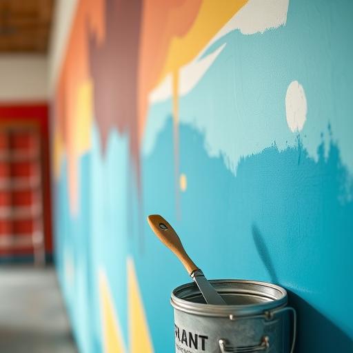
Don’t Forget the Finish! Matte, Satin, or Gloss?

The colour is only half the battle; the paint’s finish, or sheen, plays a huge role in the final look. A matte or flat finish has no shine, which is excellent at hiding minor wall imperfections. It provides a soft, velvety look that lets rich, saturated wall colours appear deep and true, allowing the texture of your textiles to take center stage.

Satin or eggshell finishes have a slight sheen, making them more durable and easier to clean than matte—a great option for high-traffic areas like hallways or family rooms. Semi-gloss and gloss finishes are highly reflective and durable, best suited for trim, doors, and cabinetry. A higher sheen will reflect more light and can subtly change how a colour appears, so always test a sample on your wall first.

Lighting’s Impact on Colour and Textiles

The way light interacts with your walls can completely change a paint colour’s appearance. Natural daylight will show the truest version of the colour, while incandescent bulbs bring out warm, yellow tones. LED and fluorescent lights can cast a cooler, bluer light. It’s so important to test your paint swatches in the room itself.

Observe the samples at different times of day—morning, noon, and night—to see how they shift. This also affects how your textiles look. A fabric that appears one way under the store’s fluorescent lights might look completely different in the warm, natural light of your living room. A cohesive design considers how paint and fabric look together under your home’s unique lighting conditions. 💡

Creating a Cohesive Palette

The goal is to create a harmonious look that feels intentional, not accidental. A great technique is to pull a secondary or tertiary colour from your main textile pattern to use as your wall colour. For instance, if your custom curtains have a large floral print with blue, green, and a tiny bit of soft yellow, painting the walls in that soft yellow can tie the whole room together beautifully.

Think about the 60-30-10 rule for a balanced space. 60% of your room should be a dominant colour (often your walls), 30% a secondary colour (your textiles, like curtains or a sofa), and 10% an accent colour (throw pillows, art, or decor). This simple guideline prevents the room from feeling chaotic and ensures your custom pieces pop in just the right way. ✨

Packaging for Luxury Goods: How Custom Mailer Boxes Protect and Elevate Your Bespoke Brand: A piece focused on how creators of high-end, custom products can use equally high-quality mailers to ensure their items arrive safely and impress discerning clients.

When you pour your heart and soul into creating high-end, custom products, the final step of the journey—shipping—shouldn’t be an afterthought. The moment a client receives their order, the packaging becomes the prologue to your brand’s story. Sturdy, beautifully designed custom mailer boxes do more than just carry an item; they protect your hard work and continue the luxurious experience you’ve promised, setting the stage for what’s inside.

Think of your packaging as the physical handshake with your customer. A flimsy, generic box can instantly devalue the perceived quality of the masterpiece within, suggesting a lack of attention to detail. On the other hand, a substantial, well-designed mailer reassures discerning clients that they have made a wise purchase from a brand that cares about every single detail, from creation to delivery.

The Unboxing Experience: Your First Physical Touchpoint

The journey from “add to cart” to “in my hands” is filled with anticipation. For luxury buyers, the unboxing is a ceremonial moment, a sensory experience that builds excitement. Your mailer box is the star of this show. Its texture, weight, and the satisfying sound it makes when opened all contribute to the customer’s initial emotional connection with your brand. It’s your first, and perhaps most important, opportunity to make a tangible impression.

This first touchpoint sets the tone for everything that follows. A premium box conveys thoughtfulness and quality, validating the customer’s decision to invest in your product. It’s a silent promise that the contents are just as exceptional. This moment of delight is what separates a simple transaction from the beginning of a long-term brand relationship. It’s an experience worth remembering and, as we’ll see, worth sharing.

Beyond the Basic Box: The Power of Personalization

A plain brown box is a missed opportunity. Customization turns your shipping container into a powerful branding tool. Imagine your logo elegantly printed on the lid, your brand’s signature color palette on display, or a clever tagline that brings a smile to your customer’s face. These elements work together to create a cohesive and instantly recognizable brand presence that extends far beyond a webpage or social media profile.

This consistency is crucial for building brand recall and loyalty. When a customer sees your unique box, they should immediately know it’s from you. This level of personalization shows that you are not a mass-market producer but a creator of distinctive goods. It transforms the packaging from a simple utility into a piece of your brand’s identity, making the delivery feel like a personal gift. 🎁

A Fortress for Your Finest: Prioritizing Product Safety

Luxury items are often delicate, intricate, and valuable. The primary function of any mailer box is protection, and for high-end goods, this is non-negotiable. High-quality mailer boxes are typically made from durable corrugated cardboard, engineered with a fluted layer that provides cushioning and impact resistance. This structural integrity is your first line of defense against the bumps and tumbles of transit.

Receiving a damaged product is a nightmare for both the customer and you. It leads to disappointment, costly returns, and a serious blow to your brand’s reputation for quality and care. By choosing a mailer box built for security, you are making an investment in customer satisfaction and peace of mind. You ensure that your creation arrives in the pristine condition it was in when it left your hands.

Designing the Interior: A Surprise Inside

The magic of a great package doesn’t stop at the exterior. What the customer finds inside is just as important. Custom-designed inserts are a brilliant way to hold your products securely in place, preventing them from shifting during shipping. Whether made from foam, cardboard, or molded pulp, these inserts present your item professionally and protect it from scratches or breakage, showing an incredible attention to detail.

You can also use the interior of the box as another canvas for your brand. Consider printing a thank-you message, a beautiful pattern, or your social media handles on the inside flaps. This “second reveal” adds another layer of surprise and delight to the unboxing process. It’s a small touch that makes the experience feel even more special and exclusive, leaving a lasting positive memory.

Eco-Conscious Choices: Sustainable Packaging for Modern Clients

Today’s luxury consumer is often an informed and conscious one. Many clients actively seek out brands whose values align with their own, and sustainability is a major consideration. Opting for packaging made from recycled, recyclable, or biodegradable materials sends a powerful message that your brand is modern, responsible, and forward-thinking. ♻️

Showcasing your commitment to the environment can be a strong selling point. It demonstrates that luxury and responsibility can go hand-in-hand. You can even add a small note on the box about its eco-friendly properties. This choice not only appeals to the growing market of green consumers but also positions your bespoke brand as a leader in conscientious business practices.

The Silent Ambassador: How Great Packaging Spurs Sharing

We live in a share-happy age, and a stunning package is practically begging to be photographed and posted online. A unique and attractive mailer box can turn your customers into brand ambassadors. The “unboxing video” is a huge trend, and people love to share their exciting new purchases on platforms like Instagram, TikTok, and YouTube.

This user-generated content is authentic, trusted, and, best of all, free advertising for your brand! When someone posts a picture of your beautiful packaging, they are giving a personal recommendation to their entire network. A small investment in an impressive box can yield an enormous return in organic reach and social proof, attracting new eyes and building a community around your products.

Your Final Presentation, Your Lasting Impression

Your mailer box is much more than a container; it’s an essential part of the product experience you provide. It serves as your brand’s representative, your product’s protector, and a powerful marketing asset. For creators of custom and high-end goods, overlooking the quality of your packaging means stopping short of the finish line and missing a key opportunity to impress.

By choosing a mailer that reflects the quality and care you put into your products, you complete the luxury narrative. You build trust, foster customer loyalty, and create a memorable moment that clients will want to relive and share. Your final presentation is what makes a lasting impression, turning a one-time buyer into a lifelong fan.

Photographing Textiles: How to Capture the Texture, Color, and Detail in Your Custom Home Decor

You’ve poured your heart into creating beautiful custom home decor, from plush velvet pillows to intricately woven tapestries. Now, it’s time to show it off! Great photography is key to making your textiles look as luxurious and appealing online as they do in person. Getting that perfect shot means paying close attention to texture, ensuring colors are true-to-life, and highlighting the fine details that make your pieces special. A little bit of photo editing magic with some top rated lightroom presets can also give your final images a professional and cohesive look.

This guide will walk you through the essentials of textile photography, from setting up your shot to the final touches in post-production. You don’t need a high-end studio or a massive budget to create stunning images. With a few simple tips and a bit of practice, you can produce photos that stop scrollers in their tracks and accurately represent the quality of your work. Get ready to make your fabrics the star of the show! 📸

Why Great Textile Photography Matters

For anyone selling or showcasing home decor online, your photos are your storefront. Since customers can’t touch or feel the fabric, your images have to do all the work. A high-quality photo can communicate the softness of a throw blanket, the rich hue of a curtain, or the delicate weave of a table runner. These visual cues build trust and help a potential buyer imagine the item in their own home, which is essential for turning interest into a sale.

Beyond sales, professional-looking photos build your brand’s identity. Consistent, beautiful imagery across your website, social media, and marketing materials creates a polished and aspirational feel. It shows that you care about quality, not just in your products but in every aspect of your business. This attention to detail can set you apart from competitors and attract a loyal following who appreciates your aesthetic and commitment to excellence.

Setting the Stage: Lighting is Everything 💡

Natural light is your best friend when it comes to photographing textiles. It’s soft, it’s free, and it renders colors more accurately than most artificial sources. The best time to shoot is during the “golden hours”—the hour after sunrise and the hour before sunset—when the light is warm and diffused. Position your setup near a large window, but out of direct, harsh sunlight, which can create strong shadows and wash out colors. If the light is too bright, you can hang a thin white sheet over the window to act as a diffuser, softening the light for a flattering effect.

What if natural light isn’t an option? You can still get amazing results with artificial lighting. The key is to make it soft and even. Using a softbox or an umbrella with your flash or continuous light will diffuse the light source, mimicking the gentle quality of daylight. Avoid using your camera’s built-in flash at all costs, as it produces a flat, harsh light that kills texture. When using artificial light, be sure to set your camera’s white balance correctly to prevent any strange color casts.

Get Your Camera Settings Right for Sharp, Detailed Shots

You don’t need the most expensive camera to get great results, but understanding a few basic settings is a game-changer. Let’s start with aperture, or f-stop. For most textile shots, you’ll want a medium to deep depth of field to keep the entire fabric in focus. An aperture of f/8 or f/11 is a great starting point. This ensures that both the front and back of a draped fabric are sharp, showing off all its wonderful detail.

Next, always use the lowest ISO setting possible (like ISO 100 or 200) to get the cleanest, most noise-free images. A higher ISO can introduce a grainy look that detracts from the fabric’s natural texture. To compensate for the low ISO and smaller aperture, you’ll likely need a slower shutter speed. This is where a tripod becomes essential! A tripod will keep your camera perfectly still, preventing any motion blur and guaranteeing a crisp, clear photo every single time.

Styling Your Textiles for Maximum Impact

How you present your fabric is just as important as your lighting and camera settings. A flat, wrinkle-free piece of fabric can look lifeless. Instead, add some dimension and visual interest by creating soft folds, gentle drapes, or a casual scrunch. This shows how the fabric moves and catches the light, which helps to better communicate its weight and texture. For example, letting a blanket cascade off the side of a chair gives a much better sense of its coziness than a simple flat lay.

Keep your background simple and uncluttered so the textile remains the focal point. A neutral background—like a white wall, a wooden floor, or a solid-colored surface—works wonderfully. You can add one or two simple props to create context, such as a coffee mug next to a placemat or a book on a pillow. Just make sure the props complement the textile instead of competing with it for attention. The goal is to tell a story and create a mood that resonates with your audience. ✨

The Magic of Angles: Finding the Perfect Perspective

Don’t just take one photo and call it a day. Experiment with different angles to showcase various aspects of your textile. A top-down shot, also known as a flat lay, is perfect for showing the full pattern of a rug or a quilt. It provides a clear, graphic view that is very popular on social media platforms like Instagram and Pinterest. Make sure you are directly above the item to avoid any distortion.

For highlighting texture, a 45-degree angle is fantastic. This perspective allows light to skim across the surface, casting tiny shadows that define the weave, knit, or pile of the fabric. You should also get in close for a macro shot. A detailed close-up of the stitching, the fibers, or a unique pattern element can be a very powerful image. It speaks to the quality and care put into the item and can be the deciding factor for a discerning customer.

Post-Processing: Bringing Your Fabric Photos to Life

A little bit of editing can take a good photo and make it great. The first step is often a simple crop to improve the composition and remove any distracting elements from the edges of the frame. You can also straighten the image if your angle was slightly off. These small adjustments create a more professional and balanced final product.

Next, focus on color and texture. Use your editing software to adjust the white balance until the colors in the photo perfectly match the colors of the real-life fabric—this is crucial for online sales. You can then make subtle adjustments to brightness and contrast to make the image pop. To emphasize texture, try slightly increasing the clarity or sharpness. This will define the weave and make the fabric look more tangible, giving your viewer an almost touchable experience through their screen. 🙌

Common Mistakes to Avoid in Fabric Photography

One of the most frequent errors is shooting wrinkled fabric. Wrinkles and creases are distracting and make a product look cheap and uncared for. Always take a few minutes to iron or steam your textiles before the shoot. It’s a small step that makes a massive difference in the perceived quality of your product. If a few stubborn wrinkles remain, you can often remove them later with a spot-healing tool in your editing software.

Another pitfall is inconsistent lighting. If you are shooting a product line, make sure your lighting is the same for every photo. A pillow that looks bright blue in one photo and navy in another will confuse customers and could lead to returns. Choose a consistent setup and time of day for your shoots to maintain a uniform look across all your images. This consistency not only helps with color accuracy but also strengthens your overall brand aesthetic.